
Colour is not merely a visual experience; it’s a powerful tool that influences emotions, perceptions, and decisions. Understanding color theory unlocks a world of possibilities, whether you’re revamping your wardrobe or selecting the perfect frame for cherished artwork.
In this guide, we delve into the fundamentals of color theory and explore how it intersects with your clothes shopping AND custom framing selections.
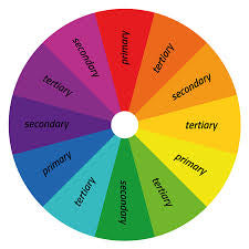
The Basics of Color Theory
Colour theory is the study of how colours interact with one another and how they can be combined to create harmonious or contrasting effects.
At its core are three primary colors – red, blue, and yellow – from which all other colors are derived. These primary colors combine to form secondary and tertiary colors, creating an extensive palette for creative expression.
Understanding Color Harmonies
Colour harmonies are combinations of colours that are aesthetically pleasing to the eye. The most common harmonies include:
-
Complementary: Colors located opposite each other on the color wheel, such as red and green or blue and orange. Complementary colors create vibrant contrasts and are often used to make elements stand out.
-
Analogous: Colors that are adjacent to each other on the color wheel, such as blue, green, and yellow-green. Analogous color schemes create a sense of harmony and cohesion, making them ideal for creating a unified look.
-
Triadic: Three colors evenly spaced around the color wheel, such as red, yellow, and blue. Triadic color schemes offer a balance of contrast and harmony, making them versatile and dynamic.
Application in Clothes Shopping
When shopping for clothing, understanding colour theory can help you create outfits that flatter your complexion and express your personal style. Consider the following tips:
-
Determine the undertone of your skin: Are you warm-toned (with hints of yellow or gold) or cool-toned (with hints of pink or blue)? Choosing clothing colors that complement your undertone can enhance your overall appearance.
-
Play with color harmonies: Experiment with complementary or analogous color combinations to create visually appealing outfits. Mix and match different hues to add depth and interest to your look.
-
Use color to convey mood: Bright, vibrant colors evoke energy and positivity, while muted tones create a sense of calmness and sophistication. Choose colors that align with the mood you want to convey.
Application in Custom Framing
Color theory is equally relevant when selecting frames for artwork or photographs. Consider the following factors:
-
Enhance the artwork: The frame should complement the colors and style of the artwork without overpowering it. Choose a frame color that enhances the tones and mood of the piece.
-
Create contrast: A frame with a contrasting color can draw attention to the artwork and make it stand out. Experiment with complementary or triadic color schemes to find the perfect balance.
-
Consider the surrounding space: Take into account the colors and decor of the room where the artwork will be displayed. The frame should harmonize with the overall aesthetic of the space while adding visual interest.
Color theory is a powerful tool that can elevate your clothing choices and enhance the presentation of artwork through custom framing.
By understanding the principles of color harmonies and applying them thoughtfully, you can create visually stunning ensembles and showcase your artwork in the best possible light.
So, whether you’re updating your wardrobe or framing a cherished piece, let color theory be your guide to creating harmonious and impactful designs!